Solace
NOV 2020
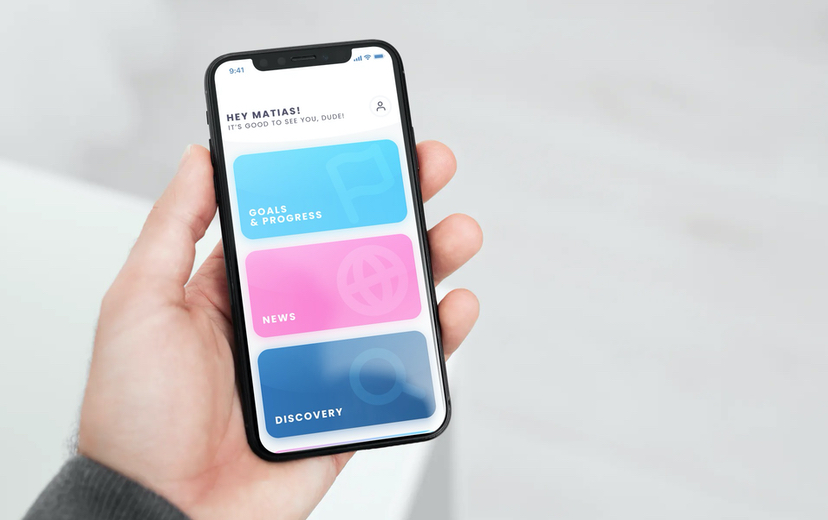
A branding and UI redesign for Solace, a transgender goal setting app, with a more modern UI and more inclusive onboarding.
Project TeammatesN/A
My RoleUI designer, graphic designer
ContextPersonal project
- Figma
- UI/UX Design
- Brand identity

Summary
Solace is is an app that provides information and resources to guide transgender people through whatever process of gender transition they desire. I had been aware of Solace for a while and I finally decided to download and see what it had to offer. I was surprised to find that the UI looked fairly outdated. As a trans designer, I decided to give them a fresh look as a personal experiment. I'm very happy with how it turned out (and so were they)!
I posted my work on Instagram and tagged Solace. Their founders liked my post and praised it in the comments. Robbie Katherine Anthony reached out and offered to work with me as well as connect me to other trans people in the tech/start-up world.
UX changes
The first thing I wanted to change about the app was the UI, but as I took a closer look I realized that there were UX improvements to be made as well. For one, the existing app uses a slider to choose pronouns from 3 options. This choice did not make sense to me, especially because it forces users to pick only one pronoun. Leaving out the possibility to use multiple pronouns (not to mention neopronouns) felt wrong for an app that is supposted to center the trans community.
Branding
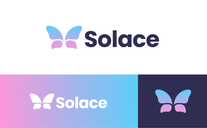
Logomark: In my opinion, Solace's butterfly is too complex for a logomark. There are a lot of small details in the wings that get lost when the logo is scaled down. I designed a simpler minimalist version of the butterfly.

Colors: For the color palette I tried to keep the colors from the trans flag - blue and pink. I changed the specific hue of pink because the one from the flag (which Solace used) looked too orange-y in this context.

get in touch
I can help you build your next website from scratch, or redesign what you already have. Reach out if you have a project in mind!