Lead With Pride
JUN 2019
Logo design for Lead with Pride - an annual leadership conference for LGBTQ+ students.
Project TeammatesN/A
My RoleGraphic designer
ContextWork for the University of Toronto - Sexual & Gender Diversity Office
- Logo design
- Branding
- Adobe Illustrator
Background
Lead with Pride and Lead with Pride: Executive Jumpstart are annual leadership conferences for LGBTQ+ students at the University of Toronto. Lead with Pridebegan in 2009 as an opportunity for student leaders to gain skills to make a positive impact at U of T and beyond. Today, the conference has grown to be a series that is aimed at supporting current student leaders, as well as expanding and diversifying LGBTQ+ student leadership on all three campuses.
The goals of Lead with Pride are to provide students with the opportunity to engage in vital conversations around LGBTQ+ leadership; develop an understanding of anti-oppression work; practice self-care; and learn tangible, hands-on skills to support student organizing and leadership.
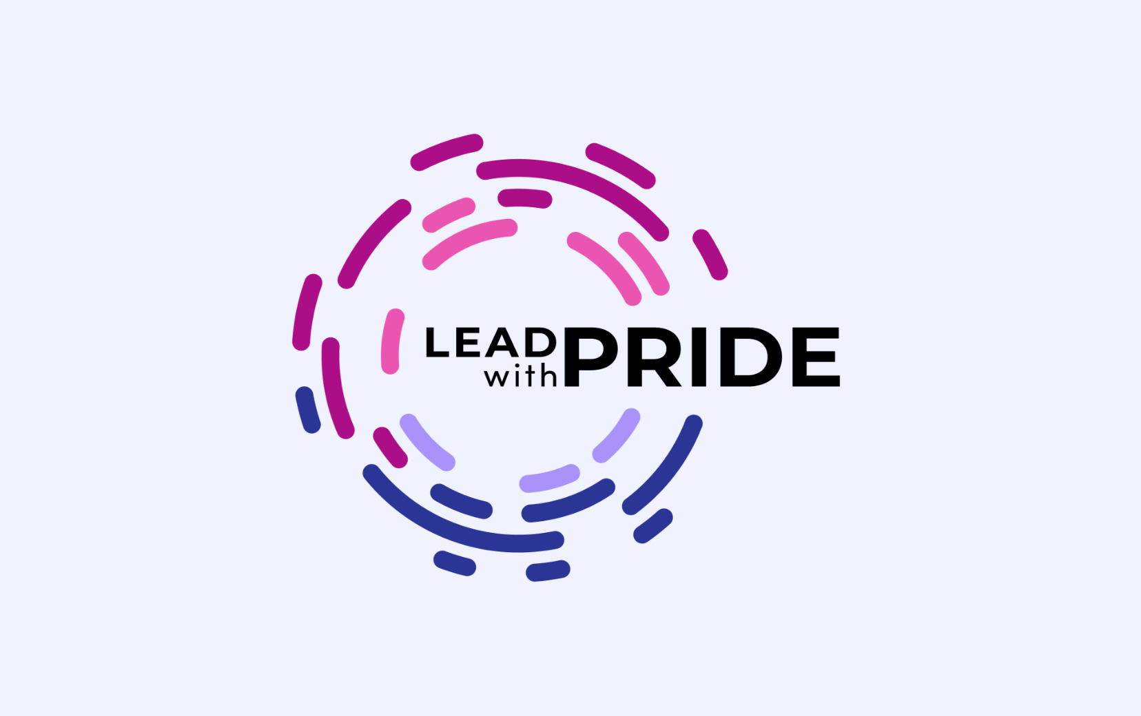
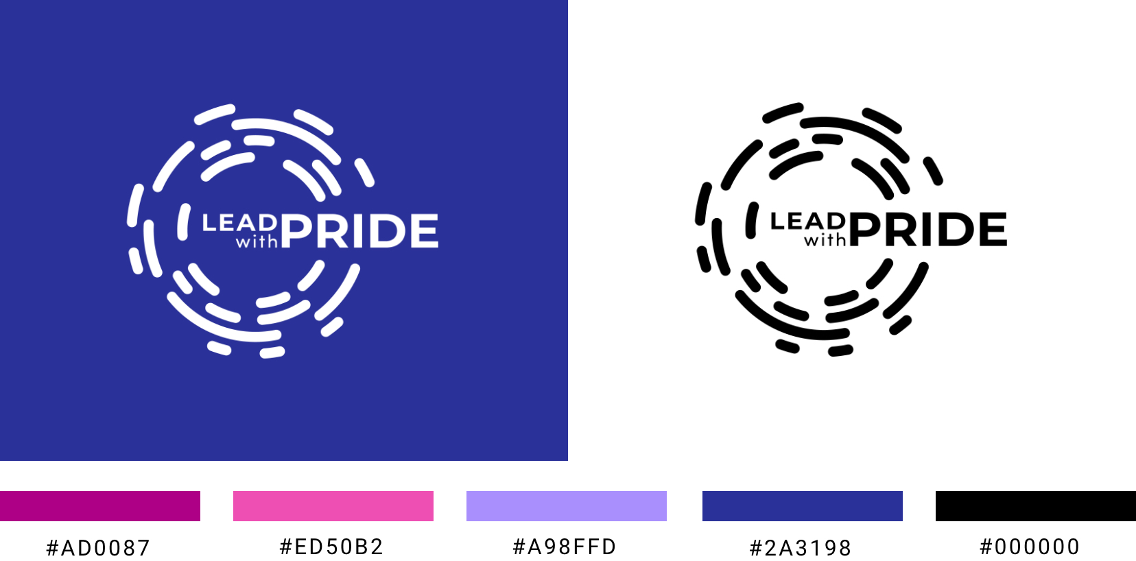
The Lead With Pride co-chairs asked me to design a logo in time for their sixth annual Lead with Pride: Executive Jumpstart conference. The logo was also used for the Lead With Pride February conference.
The Process
1. The Brief
I started by having conversations with the co-chairs about the values and principles they wanted to emphasize this year, and any aesthetic direction they had in mind.
Key concepts:
- Inner strength
- Transferable skills
- Succeeding in queer spaces and outside
- Networking - meeting people, connecting
- Community contributes to individual and vice versa
Key aesthetic traits:
- Bold
- Fun
- Professional
- Queer (purple/pink/rainbow)
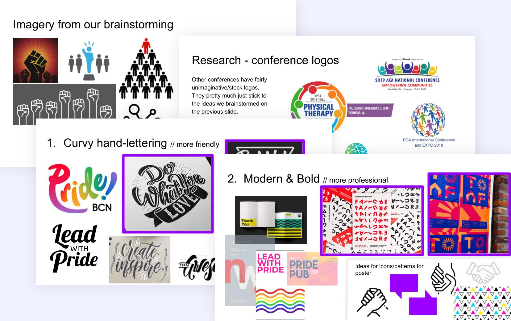
2. Moodboards + Colors
Firstly, I reminded the clients of imagery ideas they had brought up in conversation, and presented a collection of existing conference logos for context.
Then, I offered 2 options for aesthetic directions
- Curvy hand-lettering: more fun and playful.
- Modern & Bold: Geometric in nature - more professional but can be made fun by use of bold, saturated colors.
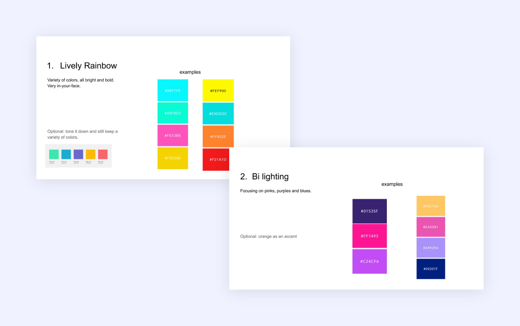
I presented 2 options for color palettes:
- Lively Rainbow: bright, neon, from a range of hues - based on the visual relationship between rainbows and queerness.
- Bi lighting: Bisexual colors - based on the modern trend of bisexual lighting used in film and television.
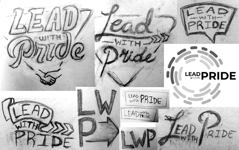
3. Sketches
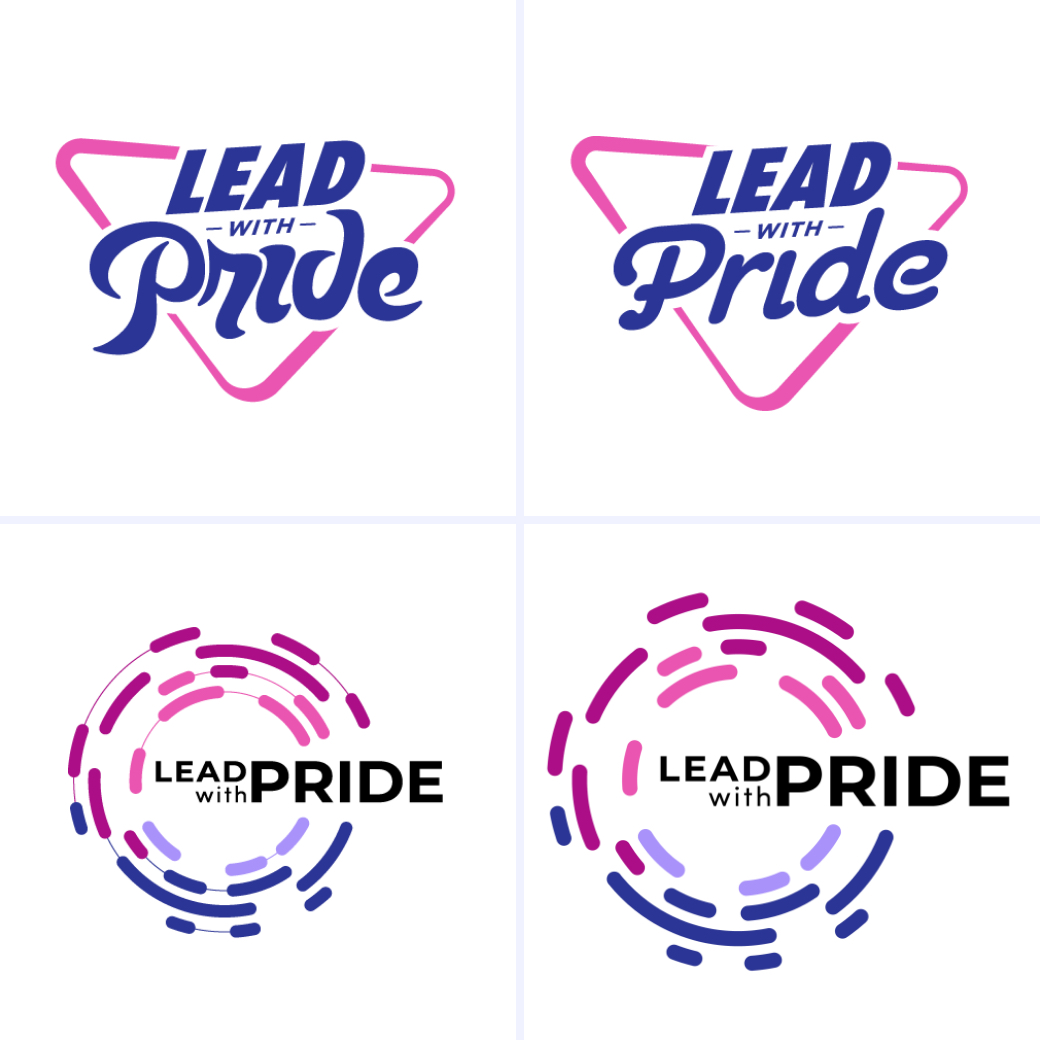
4. Final Options
get in touch
I can help you build your next website from scratch, or redesign what you already have. Reach out if you have a project in mind!